When to Use Display Fonts vs. Body Text Fonts

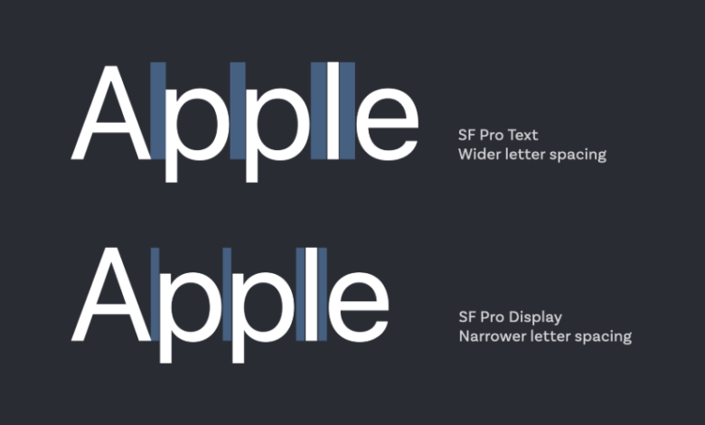
In the world of typography, understanding the distinction between display fonts and body text fonts is fundamental to creating effective and visually harmonious designs. These two categories serve distinctly different purposes, and using them appropriately can mean the difference between a compelling visual communication and a confusing, difficult-to-read mess. The choice between display and body text fonts ultimately comes down to function, scale, and the psychological impact you wish to create.
The Role and Characteristics of Display Fonts
Display fonts are the specialists of the typographic world. They are designed to be used at large sizes for short bursts of text where making a strong visual impact is the primary goal. Think of them as the headline actors on a stage—they are meant to grab attention, set a mood, and be memorable.
These fonts often possess strong personalities, with unique stylistic features, elaborate details, or exaggerated proportions that would become distracting or illegible at smaller sizes. Common examples include bold sans-serifs, elegant scripts, rugged slab serifs, and highly decorative or thematic typefaces.
Their key characteristics are high impact and distinct personality. You should deploy a display font when you need to create an immediate visual hook for elements like logos, poster headlines, website banners, book covers, and short titles. Their job is to stop the viewer and convey a specific feeling or brand identity in an instant.
See also: How to Start Making Passive Income from Home with Online Earning
The Role and Characteristics of Body Text Fonts
If display fonts are the specialists, body text fonts are the versatile workhorses. Their purpose is not to shout, but to whisper clearly and consistently for extended periods. They are designed for readability and comfort in long-form text, such as paragraphs in articles, book chapters, website content, and legal documents.
A successful body text font is characterized by clarity, neutral personality, and robust construction. It typically features open counters (the enclosed spaces in letters like ‘o’ and ‘e’), a generous x-height (the height of lowercase letters), and distinct, unambiguous character shapes that prevent confusion (like distinguishing a capital ‘I’ from a lowercase ‘l’). The best body text fonts are so comfortable to read that the reader forgets about the typeface and focuses entirely on the content. Their personality is subtle, allowing the message to take center stage.
Key Factors in Making the Choice
Several practical factors should guide your decision to use a display or body text font. The first and most critical is scale and viewing distance. Display fonts are crafted for large sizes and often for viewing from a distance. Their intricate details shine at 48 points on a poster but dissolve into a blurry mess at 10 points in a paragraph. Body text fonts, in contrast, are engineered to remain clear and legible even at small sizes on a screen or in print.
The second factor is the amount of text. Use the “glance test.” If the message can be understood in a glance—a few words or a short phrase—a display font may be appropriate. If the text requires sustained reading over multiple lines or paragraphs, a body text font is mandatory. Finally, consider the hierarchy and contrast. Often, the most effective designs use a combination of both: a distinctive display font for headlines to create interest, paired with a highly readable body text font for the content. This contrast not only creates visual appeal but also guides the reader through the information in a logical order.
Conclusion
Mastering the distinction between display and body text fonts is a cornerstone of effective typography. Display fonts are your tool for creating a powerful first impression, injecting personality, and capturing attention at a large scale. Body text fonts are your foundation for clear communication, ensuring that your audience can comfortably read and absorb lengthy information without strain or distraction. The most successful designs understand this symbiotic relationship, using a display font to stop the reader and a body text font to keep them engaged. By choosing each for its intended purpose, you ensure that your designs are not only beautiful but also functionally superior, delivering both impact and clarity in perfect balance.


